
Logos fail quietly: they look fine on the design screen and disappear everywhere else. Making one stand out is less about flash and more about a handful of deliberate choices. These are the design tips that produce logos people actually remember.
1. One Idea, Clearly Expressed
Ask what the logo says in one sentence. A monogram says “initials”; an icon says “what I do”; a wordmark says “my name”. When a logo tries to say two things, it says neither. The discipline of one idea is the foundation of the process in our logo design guide.
2. Use Color as an Accent, Not a Crutch
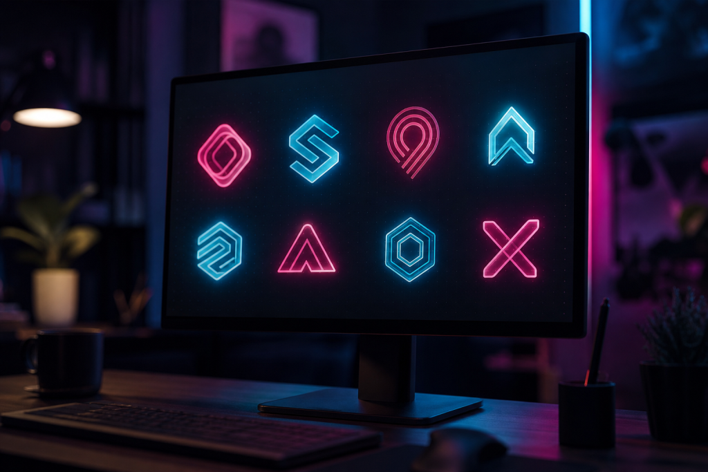
If the logo only works in full color, it will fail in half its real uses. Design it in one color, then add a second as an accent. A two-color palette — one dominant, one accent — reads better at small sizes and survives printing, embroidery, and engraving. Neon accents on dark backgrounds are a proven trick for laptop skins and stage branding because they survive distance and low light.
3. Respect Negative Space
Cramped logos feel amateur; breathing room feels expensive. Give the mark and the type enough space, keep the logo clear of busy backgrounds, and let the shapes sit comfortably inside their boundaries. When in doubt, increase the padding — it is almost always the right call.
4. Design for the Smallest Size First
Your logo’s smallest real appearance — a favicon, an avatar, a watermark — is the size that must work. Design at that size, then scale up. Details that vanish at 32 pixels are not details; they are future problems.
5. Test Against Photos and Dark Backgrounds
Logos live on stage photos, video thumbnails, and dark backdrops. Put your logo on a photograph and on black. If it disappears, adjust contrast or add a simple container (a badge, a border, a solid block). The version of your logo that works on a dark stage is the version that gets seen.
6. Keep Type Simple
Let the mark carry the personality and keep the typeface clean. Fancy fonts date fast and read poorly at small sizes. A clean sans or a confident serif with a distinctive mark outlives every trendy font.
7. Test It in One Second
Show the logo to someone for one second, then ask what they remember. If the answer matches the one-sentence idea from tip one, the logo works. If not, simplify — the audience will spend about one second on your logo too.
If you are designing for a DJ or artist brand, pair these tips with a strong name and a brief — or let a professional DJ logo designer apply them for you.